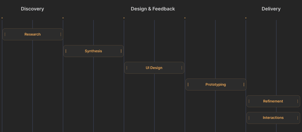
UX Research
UI Design
Design Systems
Problem statement
Clinicians spend a long time administering consents using iPads. Because the process involves both paper and digital record keeping, information may get lost or take a long time to become available. Many complain that the manual processes hinders their workflow and takes away from time that could be spent helping patients This is a problem because helping patients is a major goal of the hospital.
Business goals
1
Reduce the time required to complete in-person consents by 30%
2
Scale the number of consents able to be completed in a single flow by 2X
3
Leverage in-house Design System to consolidate and reduce disparate UI components by 80%
🫱🏼🫲🏽
Plan the Work -> Work the plan
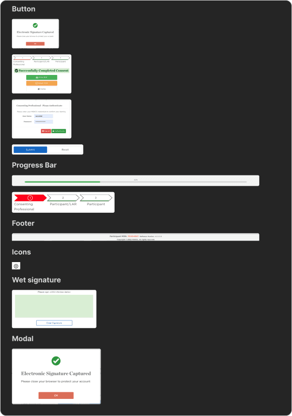
Component Audit
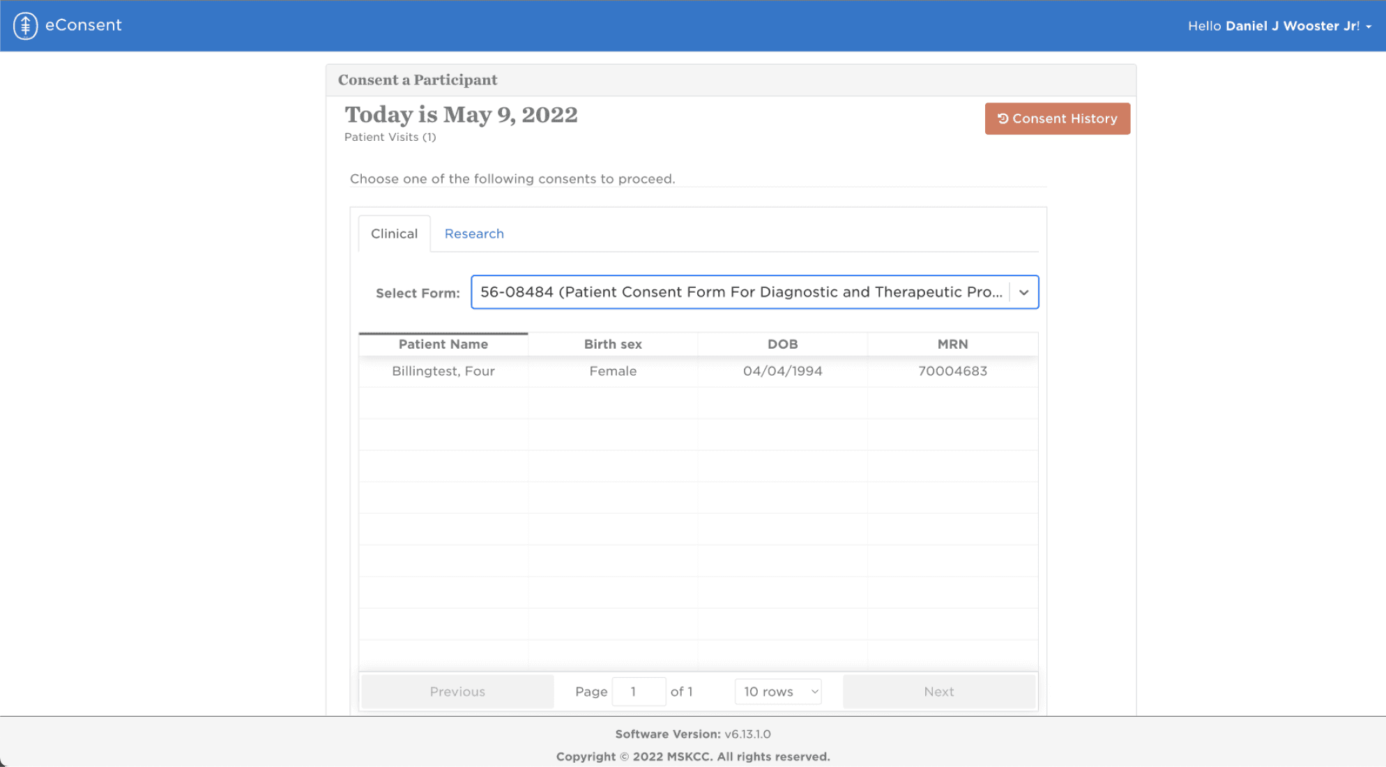
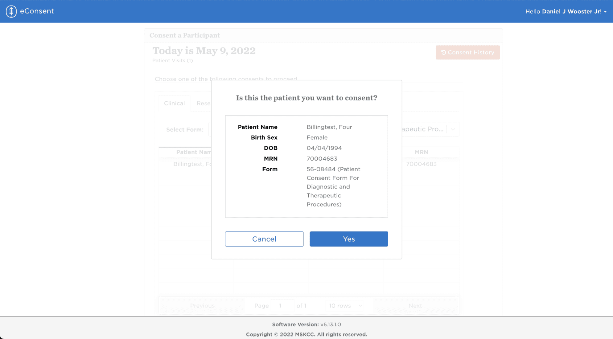
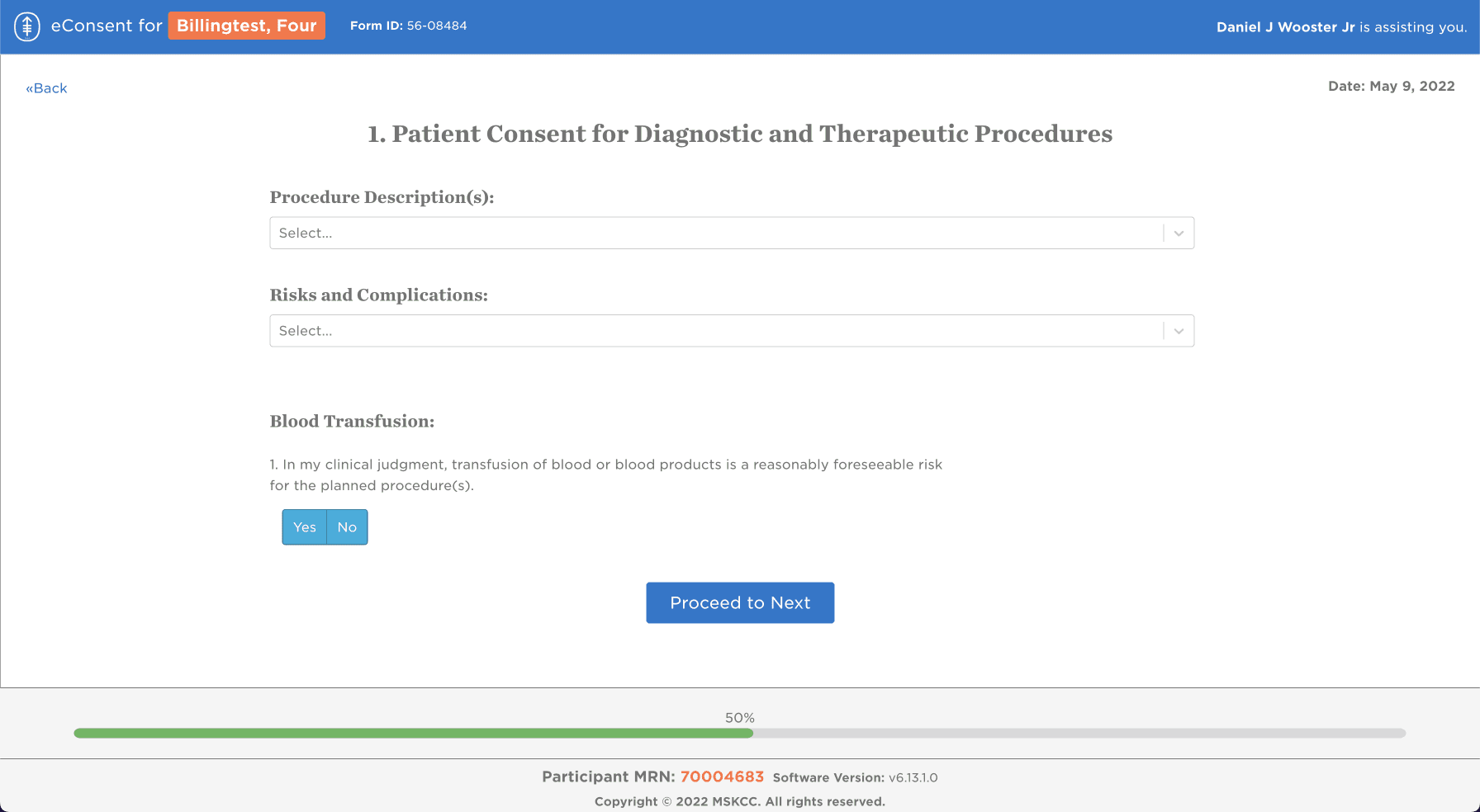
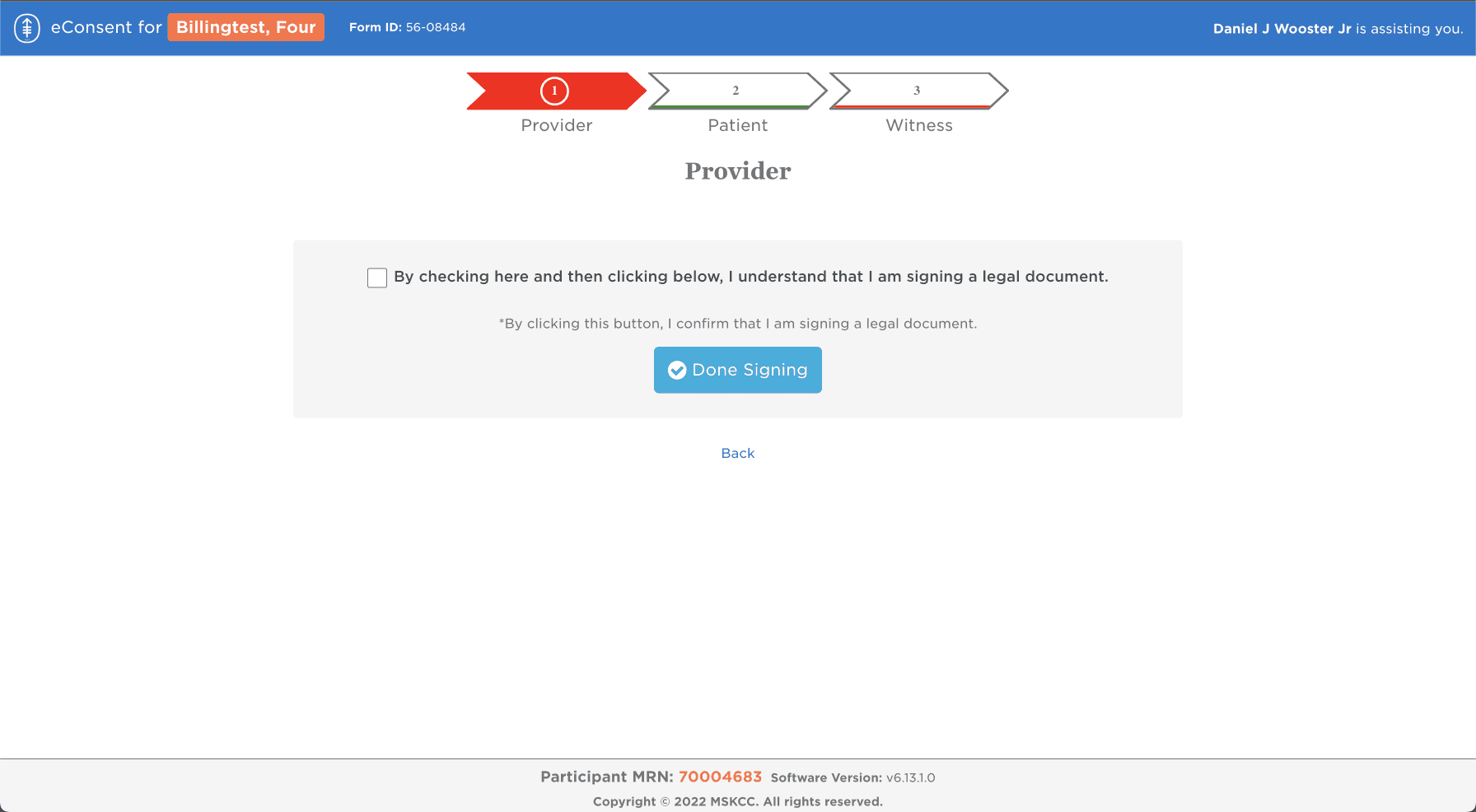
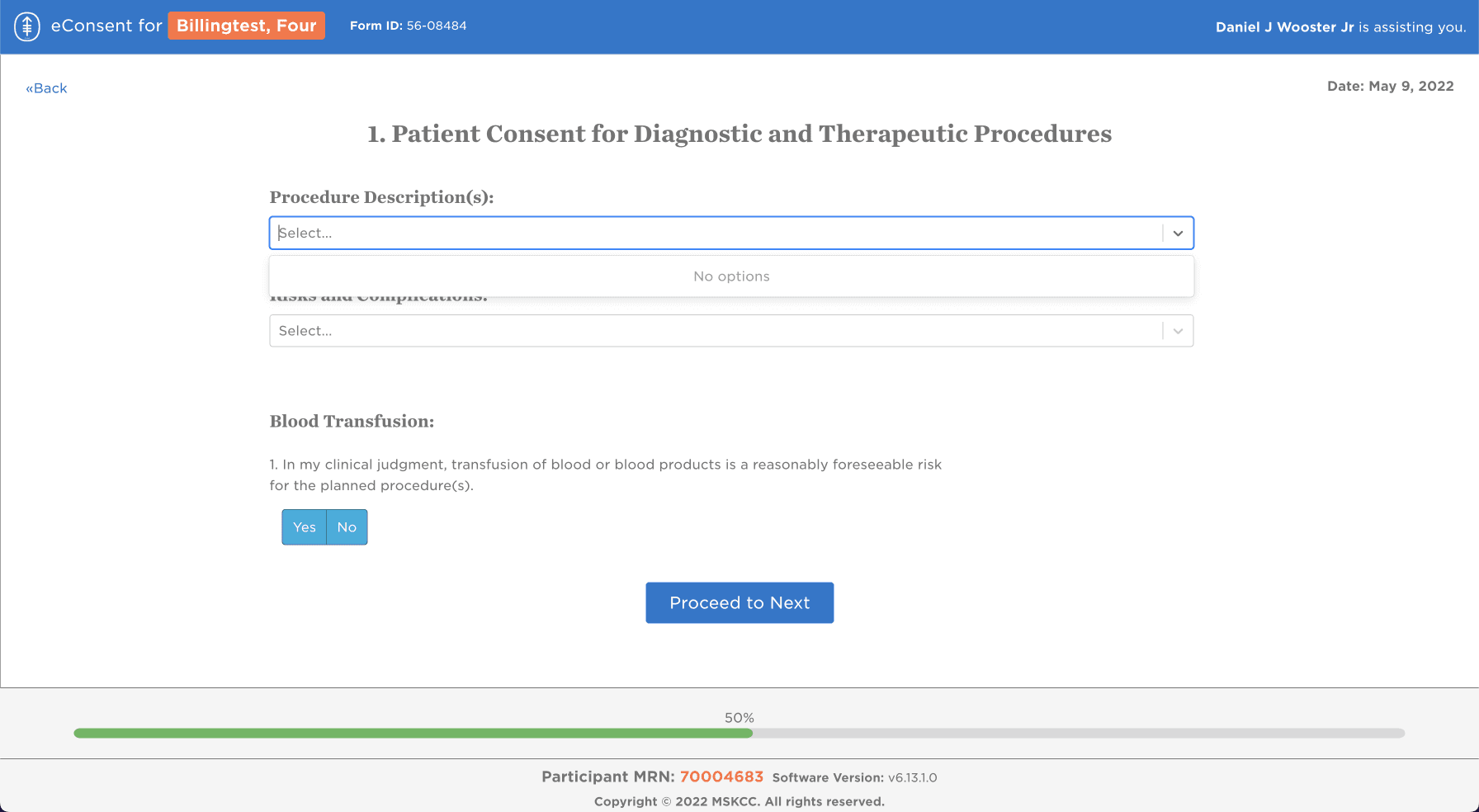
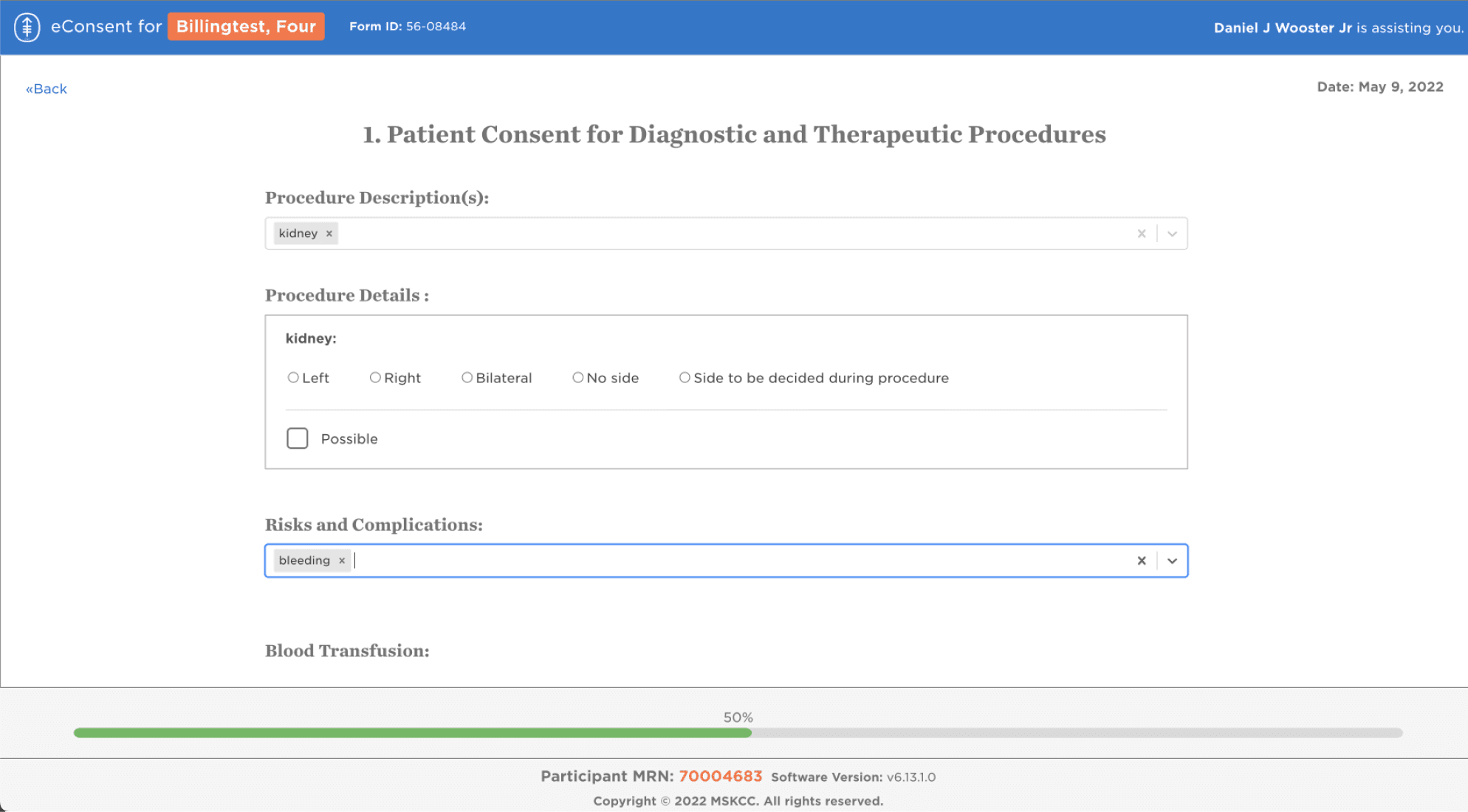
Understanding screen by screen how each of the elements were being used gave me a good idea of what the users were currently experiencing.
One button to rule them all
Buttons, for example, were used in many different ways throughout the experience. My goal was to identify and consolidate each component used, starting with buttons.
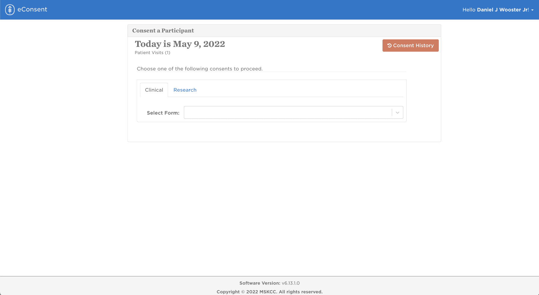
Current State
Initial Research
I began with 4 unstructured interviews understand users’ workflow, what they thought about the current application & process, and to inform user personas and flows.
New Use Cases
New use cases were emerging, such as the need to complete more than one consecutive consent, and the software was not prepared to accommodate new use cases.
Manual Processes
Using paper and scanning into databases for documentation was a cumbersome part of the process.
We love the integration with our Telemedicine platform; it feels very user-friendly from the doctor's perspective.
One major complaint from all the nurses is when the email arrives to the generic email, the subject of the email provides no identifying information about the patient.
The poor experience is what led us to use the Status Tracking dashboard, which allows us to see where patients are in the consenting process.
Key Takeaways
Tracking whether or not a patient has signed a consent was taking a considerable amount of time
Nurses were using a pooled email system, causing information to easily get lost and hard to keep track of
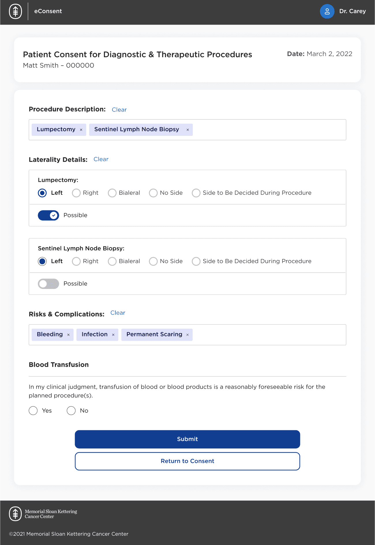
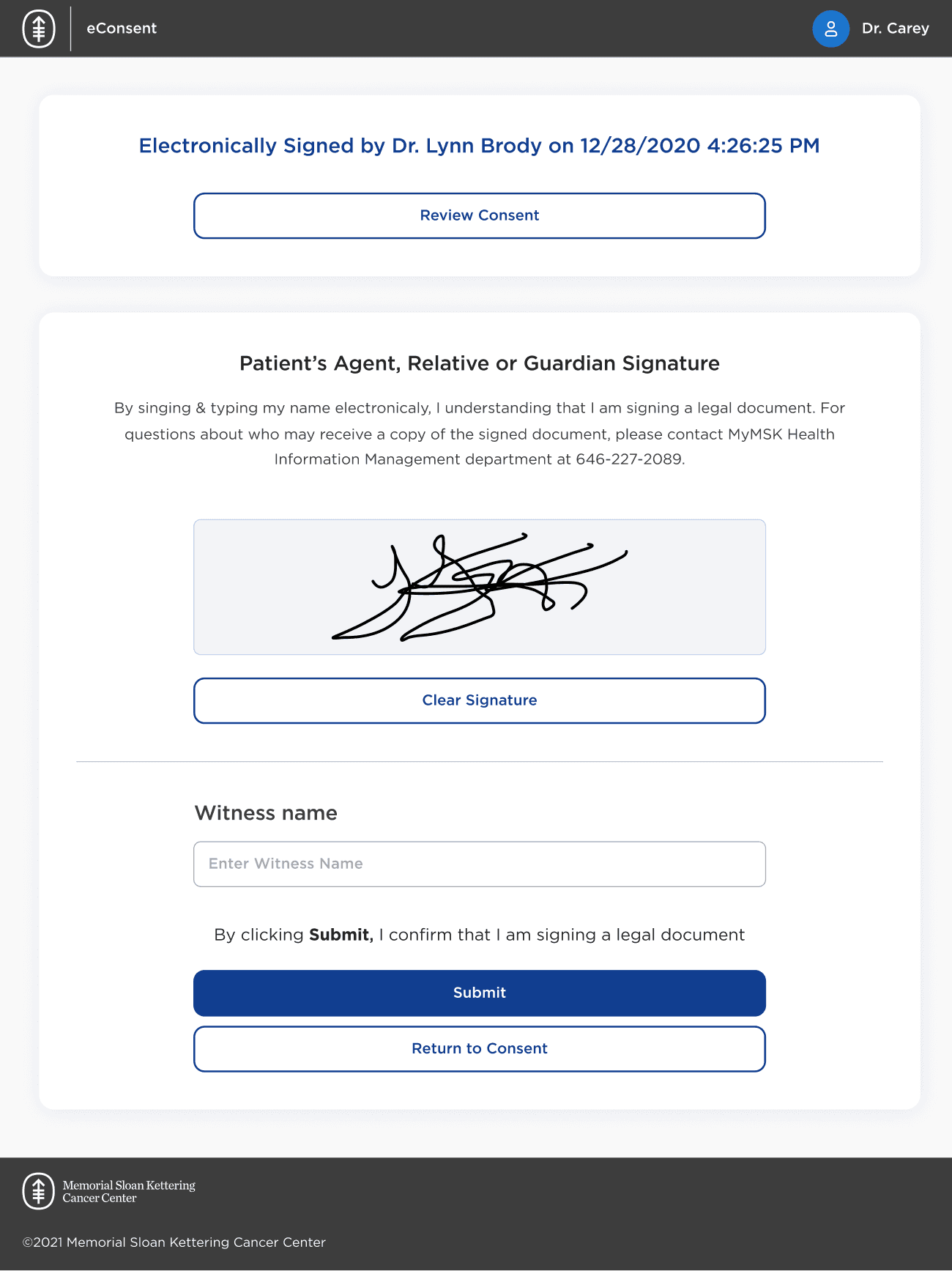
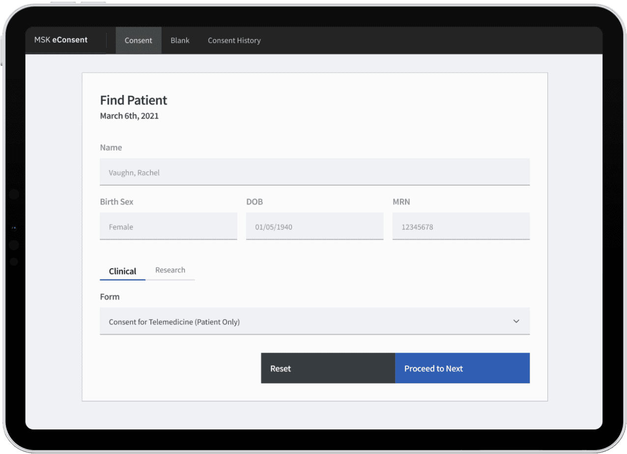
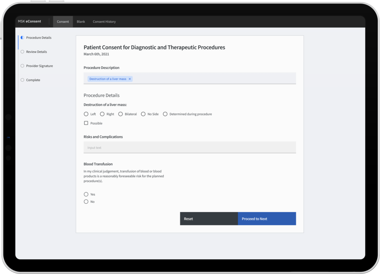
Initial Wireframes
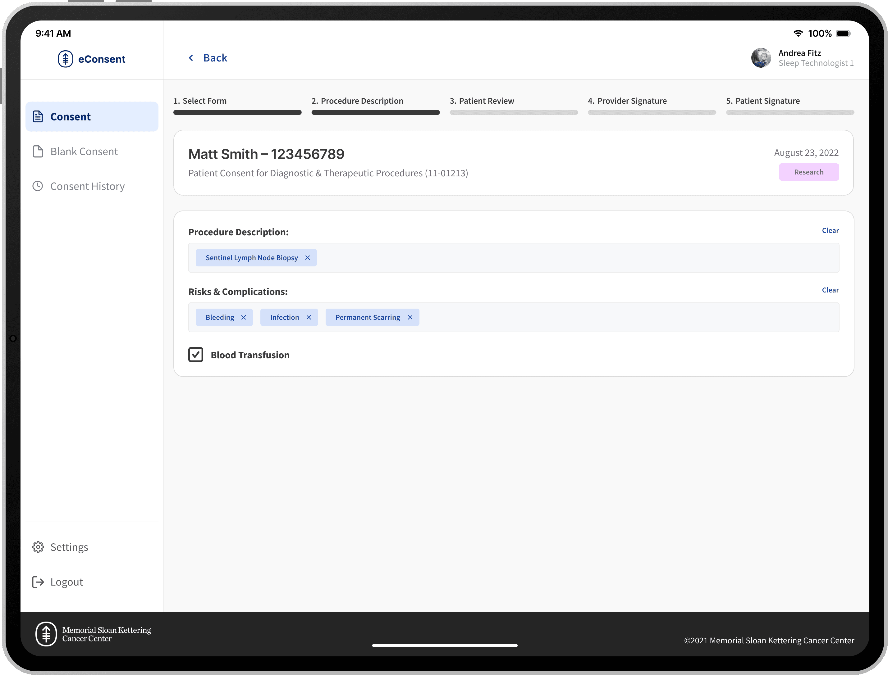
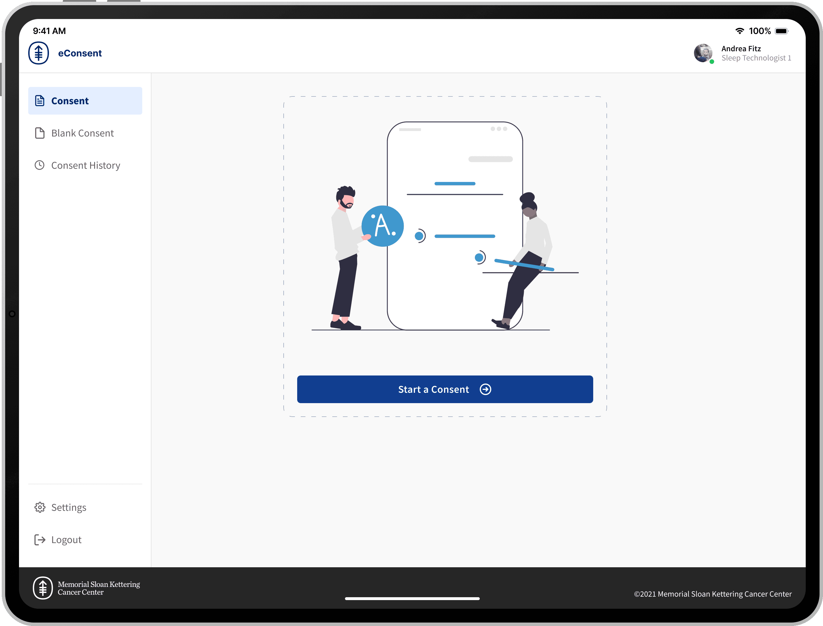
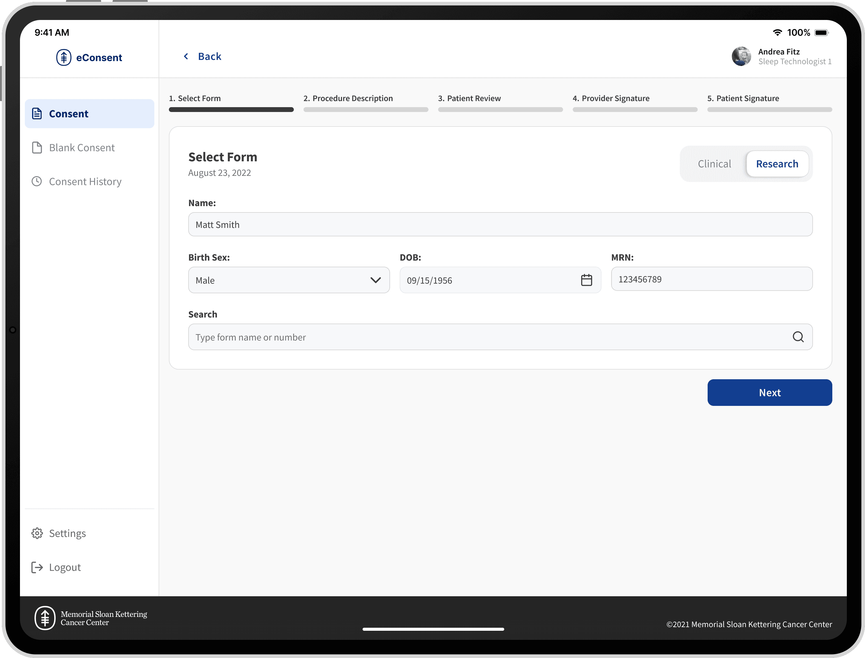
Because the entire user experience of this application contained only a handful of UI components such as buttons, tags, input fields, and radio buttons, auditing and swapping the components was a relatively straightforward process that allowed more time to focus on how we could achieve the rest of our goals for the project.
Prototyping
Usability Study Goals
1
Learn about the target user’s behavior and preferences while documenting and completing the consenting process in Sleep Studies.
2
Understand how well the design meets the need of including more than one attachment and bundled materials
3
Uncover any errors or usability problems in the workflow
4
Gauge user satisfaction and efficiency using the digital experience and note how quickly the tasks can be performed
5
Verify if daisy chaining would be problematic
Key Takeaways
Daisy chaining perceived as valuable
The user expressed delight that he was able to add an additional form at the beginning of the workflow.
Automation to save time
Automating certain fields based on metadata included in patient records was seen as a positive addition to the forms required in collecting patient consents.
Instant EHR commit seen as helpful
Committing the signed consents to the electronic health record delighted the user.
